目錄
1. SASS 基本介紹與安裝 (An introduction to SASS and Using SASS with Visual Studio)2. SASS 語法介紹1 (Variable, Mixin, and Nest structure)
3. SASS 語法介紹2 (Import, Extend, Comment, error , and @debug and @warn)
4. SASS 進階使用 (Mathematical calculations, Selector(%), Parent selectors, List)
5. SASS 進階使用 (Media, color function, If condition, loop(@for, @each), key-value mapping )
6. SASS 問題 : Web essentials 2015 does not compile automatically
前言
本篇介紹的內容中 Media queries 比較特別,為CSS3的模組。個人在執行
專案的時候發現網站樣式中使用Media queries,進行了研究並在此篇做一個紀錄,讓自己印
象深刻,也提供大家參考。以下是這次介紹的內容:
此篇文章將同步發佈於點部落與個人部落格,如果有錯誤希望前輩們不吝指教,謝謝!專案的時候發現網站樣式中使用Media queries,進行了研究並在此篇做一個紀錄,讓自己印
象深刻,也提供大家參考。以下是這次介紹的內容:
內容
- Media Queries
CSS3模組,為響應式網站(Responsive web design)設計技術,目的為了提高網頁可用性,
讓網頁顯示能符合行動裝置銀幕與一般電腦銀幕,依據目前裝置或銀幕大小,調整網頁
顯式樣式。目前不支援IE8。
在CSS2稱為Media type,在CSS3稱為Media Queries。
讓網頁顯示能符合行動裝置銀幕與一般電腦銀幕,依據目前裝置或銀幕大小,調整網頁
顯式樣式。目前不支援IE8。
在CSS2稱為Media type,在CSS3稱為Media Queries。
Media Queries 使用方法如下(Usage):
Html embed:
CSS usage:
@media screen and (min-width: 670px)  {
      // css content
}
Media Queries 語法如下(Syntax):
@media [media type] and [media feature]
[media type] : braille | embossed | handheld | print | projection | screen | speech | tty | tv
[media feature] : 詳細請參考 -> Media queries
- Can use Max/Min prefix:
color | color-index | device-aspect-ratio | device-height | device-width | height |
monochrome | resolution | width
- Cannot use Max/Min prefix:
grid | scan
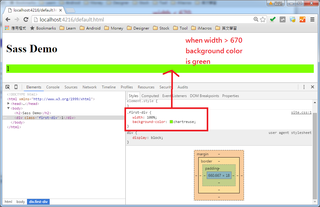
@media screen and (min-width: 1000px)
{
    //....
}
Media Queries Example
@media screen and (min-width: 1000px) {
    //當寬度 >= 1000px,這段程式碼會重新載入
    //when width >= 1000px, this section will be reload
}
@media screen and (min-width: 670px) and (max-width: 1000px){
    //當 寬度 在670px ~ 1000px 之間,這段程式碼會重新載入
    //when width between 670px and 1000px, this section will be reload
}
@media screen and (max-width: 670px){
    //當寬度 <= 670px,這段程式碼會重新載入
    //when width <= 670px, this section will be reload
}


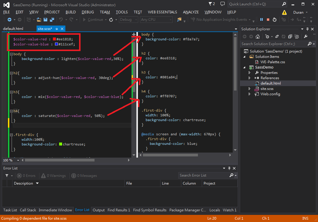
- Color function
你可以使用color function,像是lighten, adjust-hue, mix, saturate...等等。
You can use color function, such as: lighten, adjust-hue, mix, saturate...etc.
You can use color function, such as: lighten, adjust-hue, mix, saturate...etc.
$color-value-red : #ee1818;
$color-value-blue : #111cef;
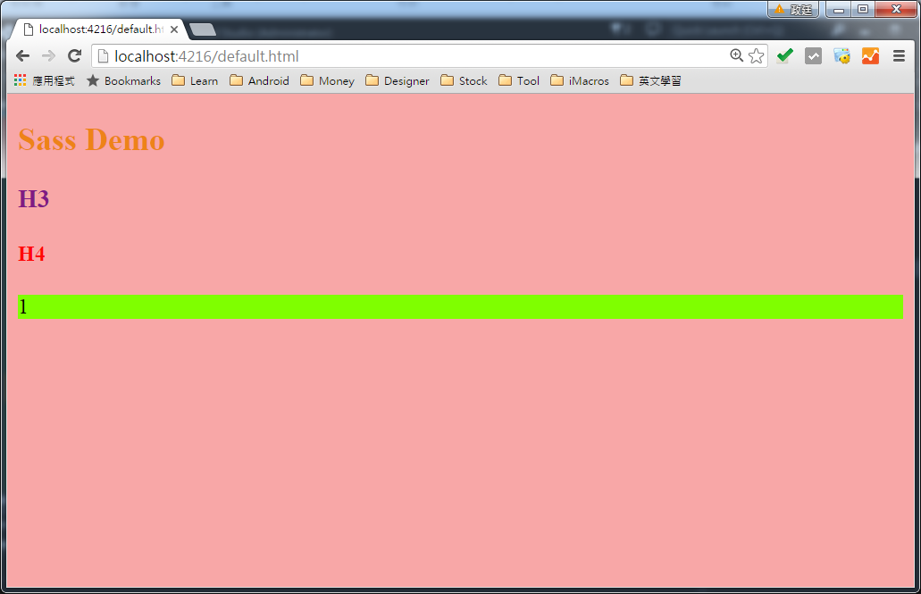
body {
background-color : lighten($color-value-red, 30%);
}
h2{
color : adjust-hue($color-value-red, 30deg);
}
h3{
color : mix($color-value-red, $color-value-blue);
}
h4{
color : saturate($color-value-red, 50%);
}
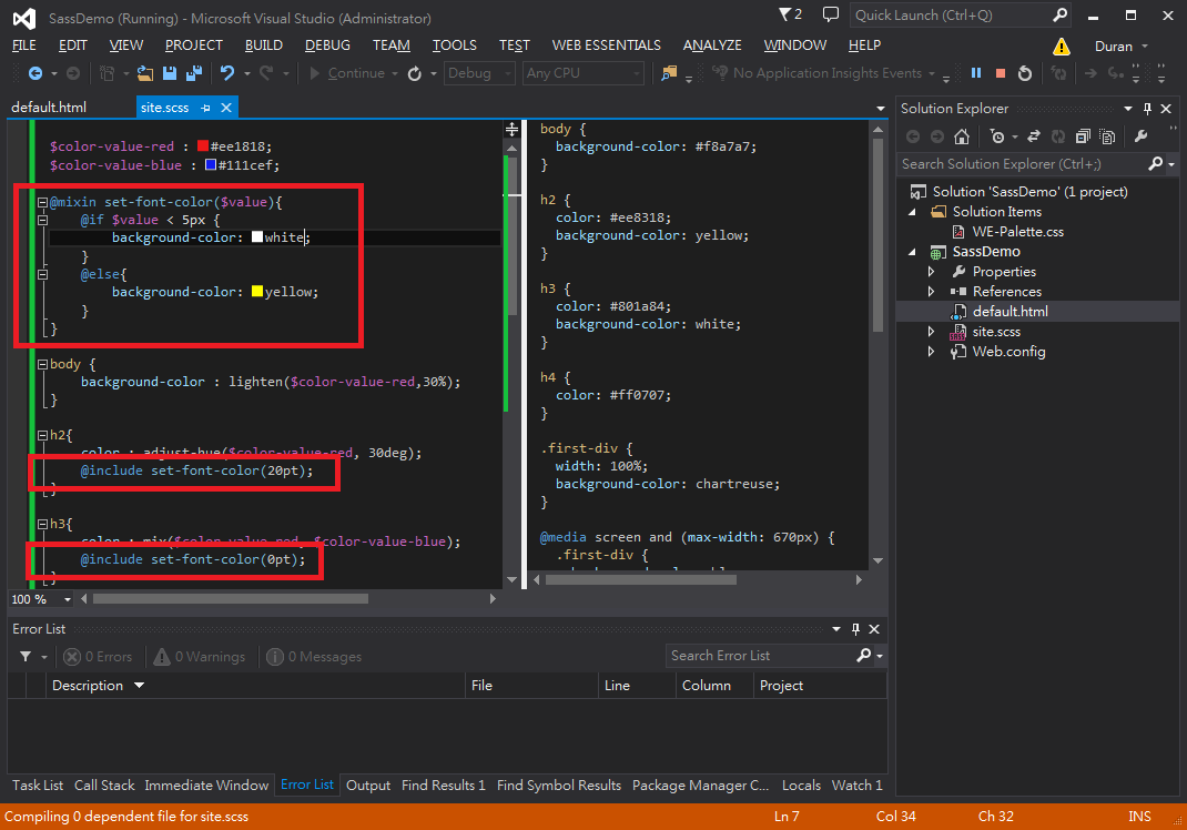
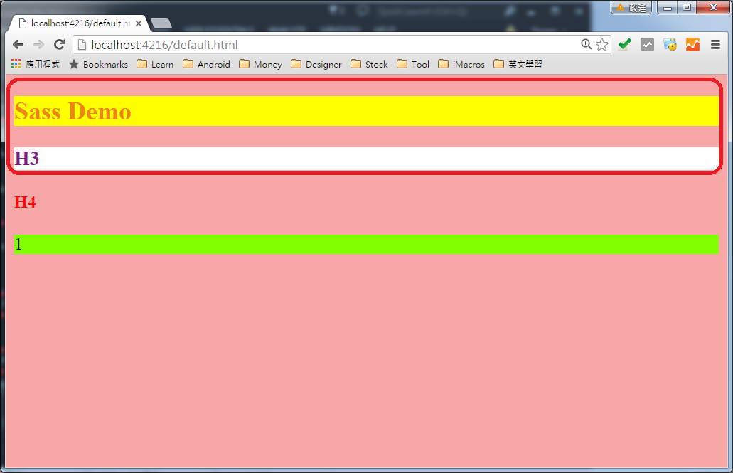
- If condition
Usage as below:
@mixin set-font-color($value){
    @if $value < 5px {
        background-color: white;
    }
    @else{
        background-color: yellow;
    }
}


h2{
    @include set-font-color(20pt);
}

h3{
    @include set-font-color(0pt);
}
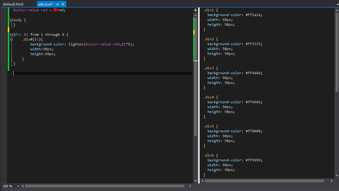
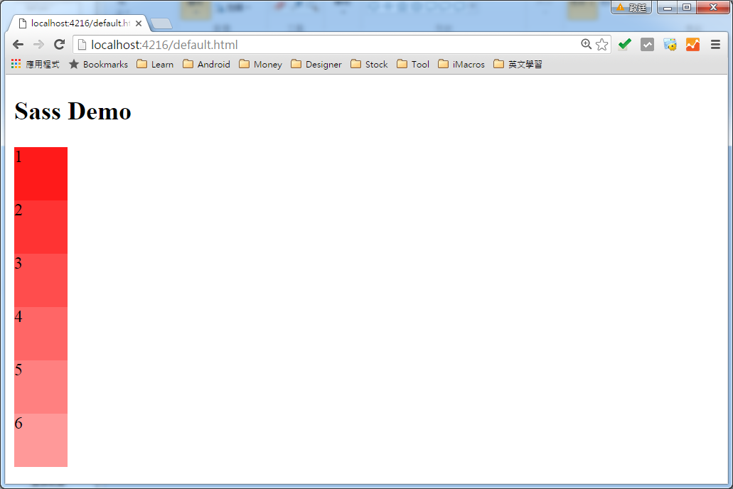
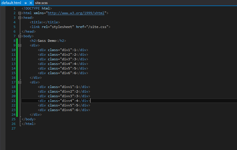
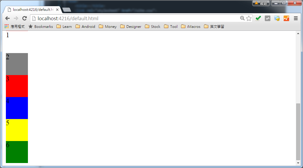
- Loop(@for, @each)
@for:$color-value-red : red;
@for $i from 1 through 6 {
.div#{$i}{
background-color: lighten($color-value-red,$i*5);
width:50px;
height:50px;
}
}

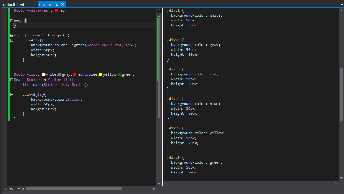
@each:
$color-list: white,gray,red,blue,yellow,green;
@each $color in $color-list{
    $i: index($color-list, $color);

    .divv#{$i}{
        background-color:$color;
        width:50px;
        height:50px;
    }
}
- Key-value mapping
$color-key-value-list: (
    keya: #eb1f57,
    keyb: #ef16d0,
    keyc: #2826e2,
    keyd: #19f3a3,
    keye: #358f0b,
    keyf: #8ea10f
);
@each $key, $color in $color-key-value-list{

    .#{$key}{
        background-color:$color;
        width:50px;
        height:50px;
    }
}


範例程式
- https://dl.dropboxusercontent.com/u/13585157/SassDemo5.zip
- https://dl.dropboxusercontent.com/u/13585157/SassDemo6.zip
參考資料
- CSS3 MEDIA QUERIES 詳細介紹與使用方法,RESPONSIVE WEB DESIGN 必備技術 - FunDesigner
- CSS3 @media Rule - w3school
- Adding Style with CSS - Microsoft Virtual Academy
- Media queries - Wiki
- Mobile Web 前端技術筆記(二): Media Queries 與 CSS - 烏托比亞
- simplifying css in visual studio with sass - pluralsight


, key-value mapping ))
0 留言